
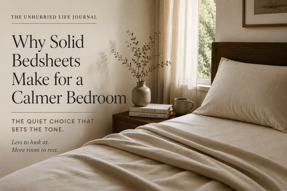
Most decisions about bedsheets get made on feel — the weave, the weight, how the cotton sits against skin. Pattern is usually an afterthought, chosen last, if it is chosen consciously at all. But the print, or the absence of one, does something the fabric itself cannot: it sets the visual tone of a room the moment you walk in, long before you have noticed the thread count.
If you are furnishing a bedroom meant to feel unhurried, this is worth pausing on.
Why the eye reacts to pattern before the mind does
A bedroom is processed visually before it is processed any other way. Colour, contrast and repeating shapes all compete for attention in the same glance, and a busier surface simply asks more of the eye to resolve. This is not just a design opinion. A well-known study from researchers at UCLA found that the language people used to describe their homes — cluttered and unfinished, or restful and orderly — correlated directly with their daily cortisol patterns, a marker of physiological stress (Saxbe & Repetti, 2010). A busy bed is a small thing in isolation, but it is also the largest single surface in most bedrooms, and one your eyes fall on both before sleep and immediately after waking.
The case for solid bedsheets
Plain, solid-colour sheets give the eye nothing to resolve. There is no motif to trace, no repeat to register, no clash to reconcile against the curtains or the rug. In a bedroom this reads as visual quiet — the same quality that makes a well-made bed in a good hotel room feel restful rather than merely tidy. It is also why most guidance on preparing a bedroom for good sleep points to a calm, uncluttered environment as a basic condition, alongside darkness, cool temperature and quiet (Sleep Foundation). A solid sheet in a warm neutral, a soft clay, or a deep, muted tone does this work quietly, without needing to be noticed to be effective.
Solid sheets are also easier to live with over time. They do not date the way a seasonal print can, they layer easily with new cushion covers or a change of curtains, and they do not compete with the textures already in the room — a cane headboard, a linen curtain, a wooden side table. Our percale collection and sateen collection are both built around this idea: the weave itself provides the texture and quiet visual interest, so the sheet does not need a print to feel considered.
Where printed sheets still earn their place
None of this makes pattern wrong. A fine stripe, a subtle check, or a small-scale motif in tonal colours can add warmth to a room that otherwise reads as flat or unfinished, particularly in a mostly white or neutral space. The distinction that matters is scale and contrast, not pattern versus no pattern. A large-scale print in high-contrast colours asks a lot of the eye and tends to dominate a small bedroom. A fine, tonal pattern — stripes in two close shades of the same colour, for instance — behaves visually much closer to a solid than to a bold print, and can add just enough texture to keep a very pared-back room from feeling sterile.
The test worth applying is simple: stand at the door of the bedroom and look at the bed for a few seconds. If your eye settles, the pattern is working. If it keeps moving — tracing the repeat, following a border, comparing colours — the sheet is asking more of you than a bed should.
A simple way to decide
If you are starting from scratch, or if your bedroom already carries pattern elsewhere — a rug, curtains, an upholstered headboard — a solid sheet is almost always the calmer choice, and the safer one. It lets the room's other elements carry visual interest while the bed itself recedes into comfort. If your walls, floor and furnishings are already quiet and neutral, a fine, tonal pattern can be introduced on the bed without disturbing that calm, so long as it stays subtle in scale and colour.
Either way, the goal is the same one behind most of what we write about at The Unhurried Journal: a bedroom that asks less of you, not more. Pattern is a legitimate design choice. It simply should not be an accidental one. Browse our full range of cotton home linen to see how far a well-chosen solid, or a quiet, considered stripe, can go toward making a room feel unhurried.